
Stompa Part 1

Something as big as this Stompa is always a daunting task, but also a fun one. I start most projects with some level of research, unless they are just batch paint jobs. Even when I know my color scheme it’s good to see how others balance colors across a model. In this case I wanted something special. After doing a good amount of research I came across this as the basis for my stompa:
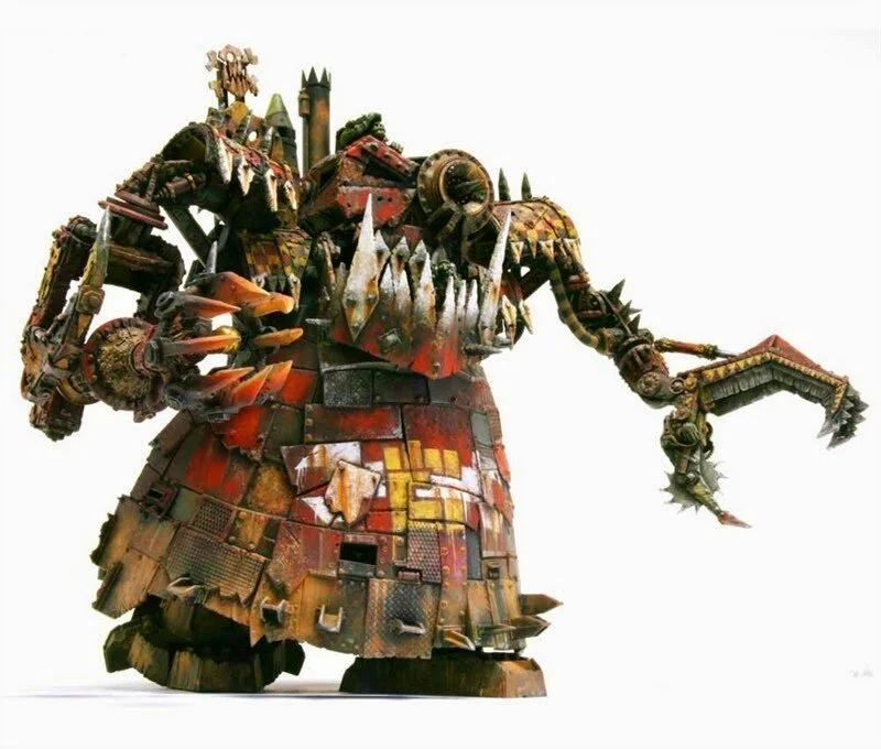
This model has the same primary colors as my army’s vehicles: red, white, and a mustard color that I use for checks. I love the weathering and how old it looks. I’m not aiming to look ‘exactly’ like this, but just to have the final result feel similar, and to use this model as a guide.
Step one was to lay down my base colors:


At this stage my primary colors are in place. The leadbelcher for silver, a medium grey for the white areas, mournfang brown for the mustard areas, and Khorne red for the red areas. I got a bit carried away and ended up adding the next two red layers, those being Wazdakka red and Khador red from the P3 line (my favorite bright red I’ve ever found both for color tone and coverage). I did all these colors at once to get a sense for how everything balances against one another, but that being said, many of these colors will be quite different by the time they’re done. The silver will be more muted, for example.
The next stage I finished layering my three non-metallic colors: red, yellow, and white. My goal is to get the whole model to the ‘washes and weathering’ stage, then go back and paint individual details like the characters, missiles, glyphs, lights, horns, etc.
It’s worth noting, the red and white were done with sponges and stippling. The yellow and silver areas were painted on with a brush. The yellow in particular took many layers to get to the color I wanted. The red already has an Agrax Earthshade wash and some touch-up to keep the red bright.


At this point I really thought I was done with all the red, yellow, and white areas other than washes and weathering, but after looking back at my core reference and a few other images I decided that I still have a lot of work left, mainly in the following areas:
The red panels aren’t right. All the color is concentrated at the panel centers. Looking back at my reference the ‘fading’ really happens more towards the top of the panels. This makes sense, as paint would tend to fade and chip away from the top down. I need to go back and fill out the red panels more.
The arms are all metal. I need some red on both of them to balance things out. I’m going to go ahead and paint the missiles red and do something on the chain choppa monstrosity.
I need to work silver into the the black areas a bit more to make them feel like the paint has worn aware from bare metal, the idea being that the red is painted on top of a black primer, so some of the primer is exposed, and then some of the bare metal. I was always planning on doing this after the washes, but now I’m thinking it should be part of the wash process to make sure everything looks sufficiently old.
That's all for part 1!